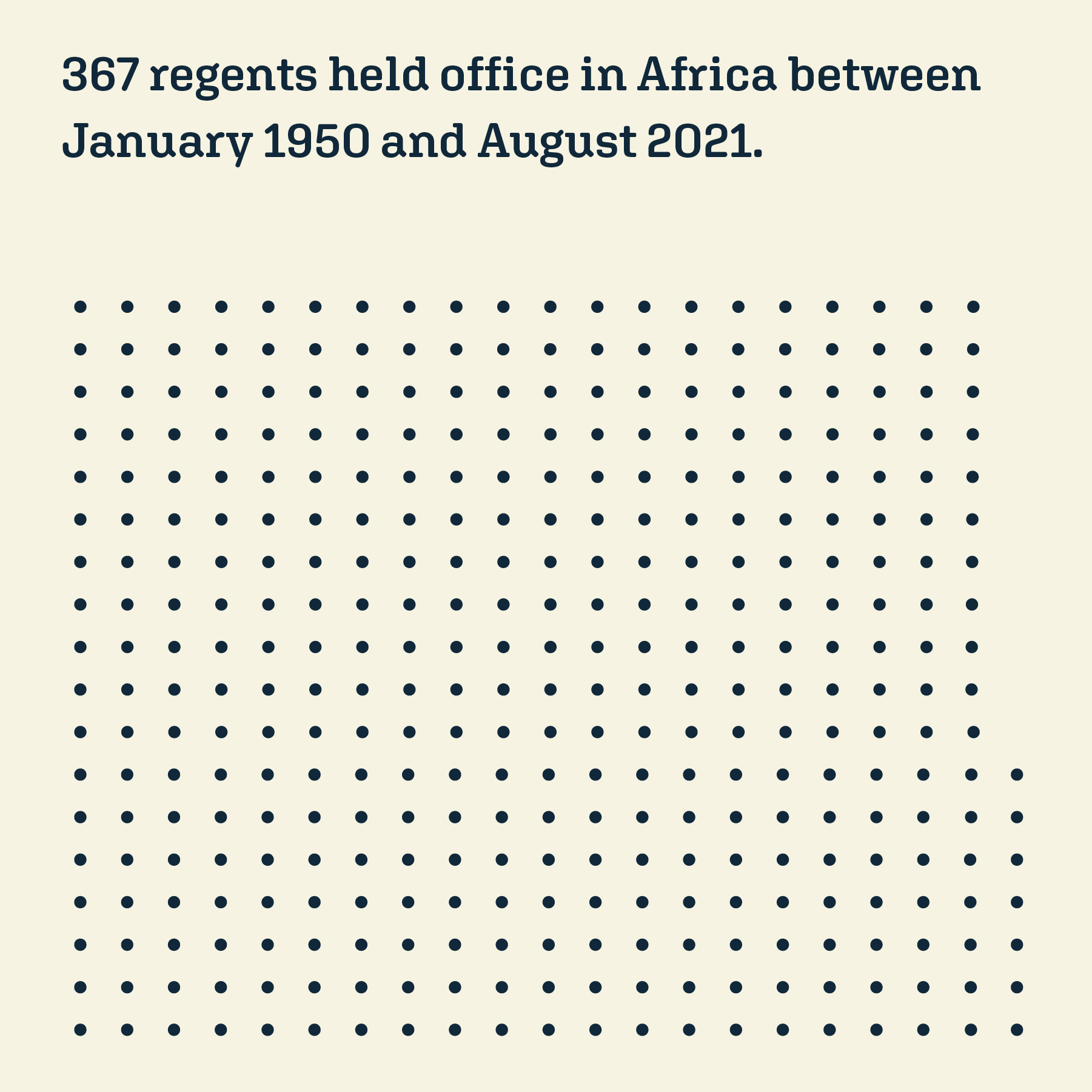
Data visualisations on political developments in African states and their presidents
From October 2021 to March 2022, I attended the CAS course “Data Visualization”. Parallel to the course modules, each student worked on her own visualisation project. Since my partner and I regularly marvel at African rulers and their long terms in office, I decided to look at African governments. I was lucky enough to find a great dataset: the REIGN dataset contains all the rulers of the world between 1950 and August 2021 with a lot of parameters. With this dataset, I developed two visualisations: The first visualisation focuses on the individual countries of the continent and shows their political development. The second visualisation focuses on the individual rulers and shows who has been in office for how long. While designing these two visualisations, I noticed how underrepresented women are. So I decided to create an AR layer for both visualisations to make the women more visible. And since it was part of the task to use a second medium, I created some Instagram posts about the nine African women presidents.
Date: October 2021 – March 2022 / Personal project created during the CAS Data Visualization / School: Bern University of Applied Sciences and Bern Academy of the arts / Concept and design: Monika Rohner / Dataset: Bell, Curtis, Besaw, Clayton., Frank, Matthew. 2021. The Rulers, Elections, and Irregular Governance (REIGN) Dataset. Broomfield, CO: One Earth Future. Available at https://oefdatascience.github.io/REIGN.github.io/
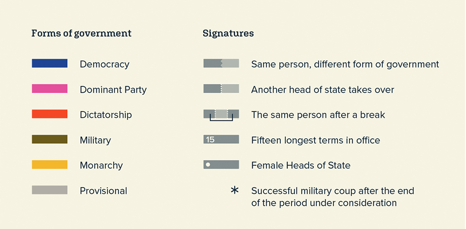
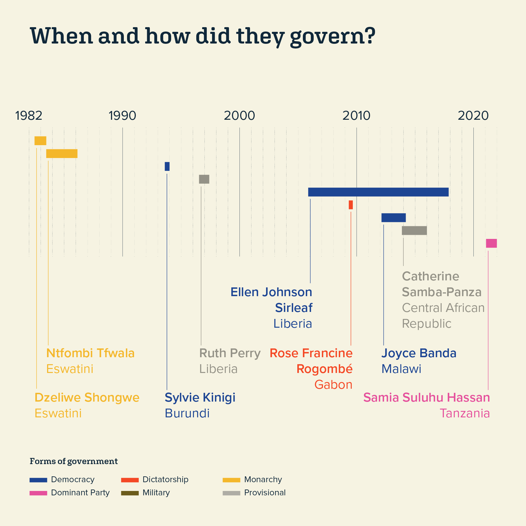
Methodology: The REIGN dataset captures the form of government in 16 categories. For the visualisation, some categories were combined as follows: Democracy: Presidential Democracy, Parlimantary Democracy; Dominant Party: Oligarchy, Dominant Party; Dictatorship: Personal Dictatorship, Party-Personal-Military-Hybrid, Party-Personal, Military-Persona; Monarchy: Monarchy; Military: Indirect Military, Party-Military, Military; Provisional: Provisional-Military, Provisional Civilian, Warldordism
Please note: The initial visualisations were created in German. All texts are translated with the help of deepl.com translator
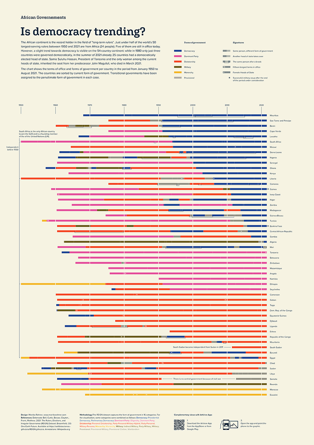
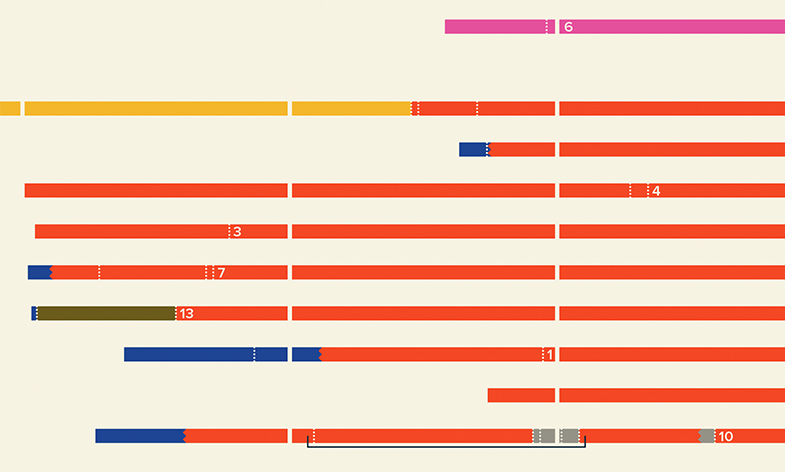
↑ This visualisation focuses on the individual countries of the continent and shows their political development from 1950 to August 2021. The countries are sorted by the latest form of governement. The visualization shows that the number of blue countries (= democratic) is increasing compared to the 1980s.
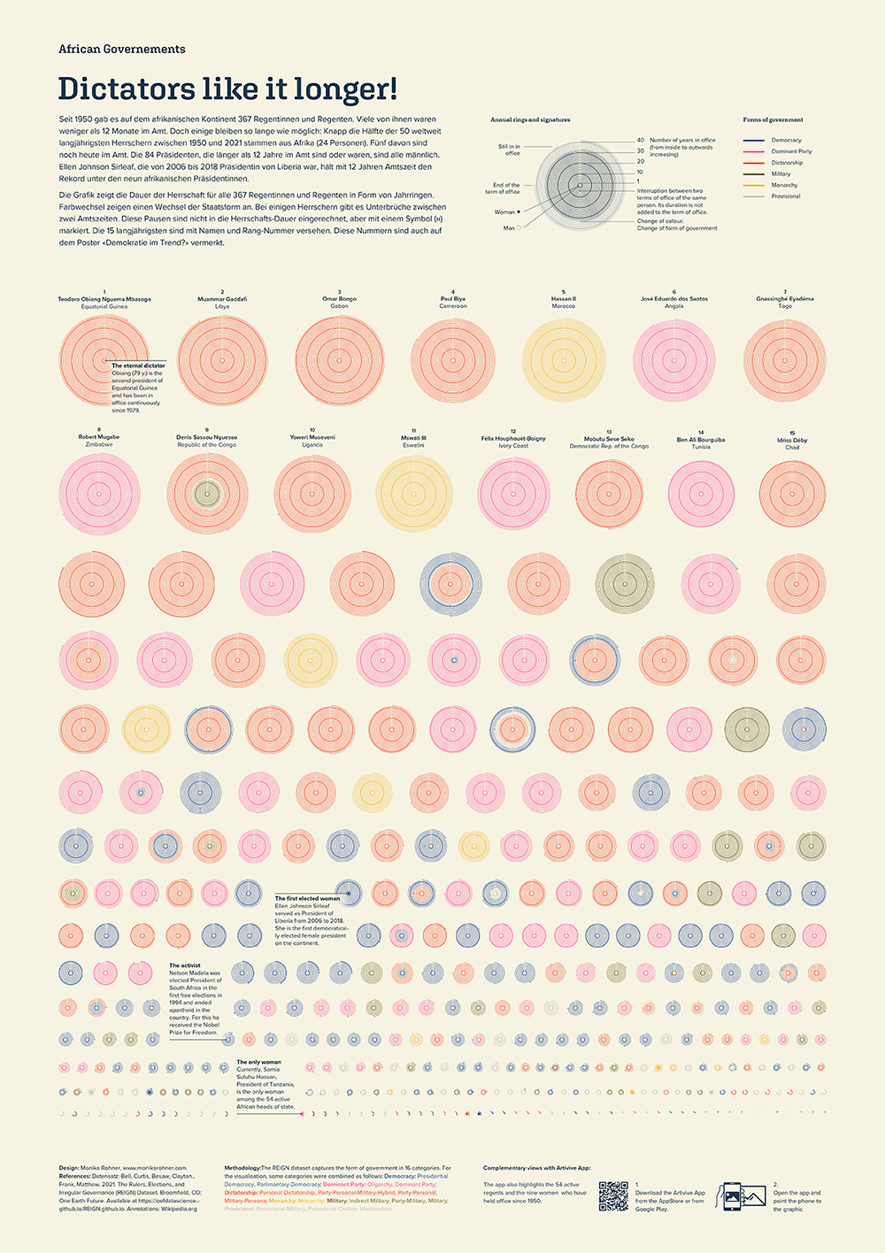
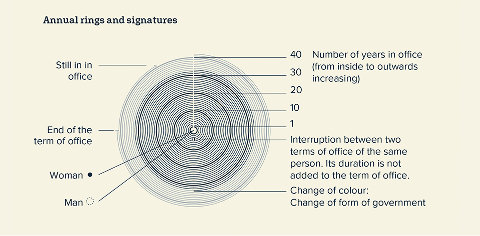
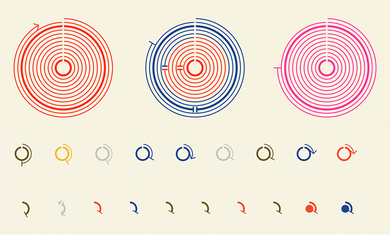
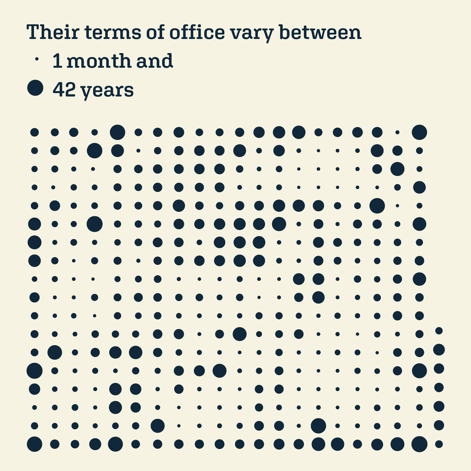
↑ This second visualisation focuses on the individual rulers and shows who has been in office for how long. Unfortunately I couldn’t label all the circles due to format restrictions. A digital version with mouse over option would be amazing 😉
↑ If you look at the first visualisation through Artivive App you would see this animation that hilights the nine women who have been in power since 1950 and the 15 men who have been in office longest.
↑ If you look at the second visualisation through Artivive App you would see again the nine women who have been in power since 1950 and the 54 actual leaders.
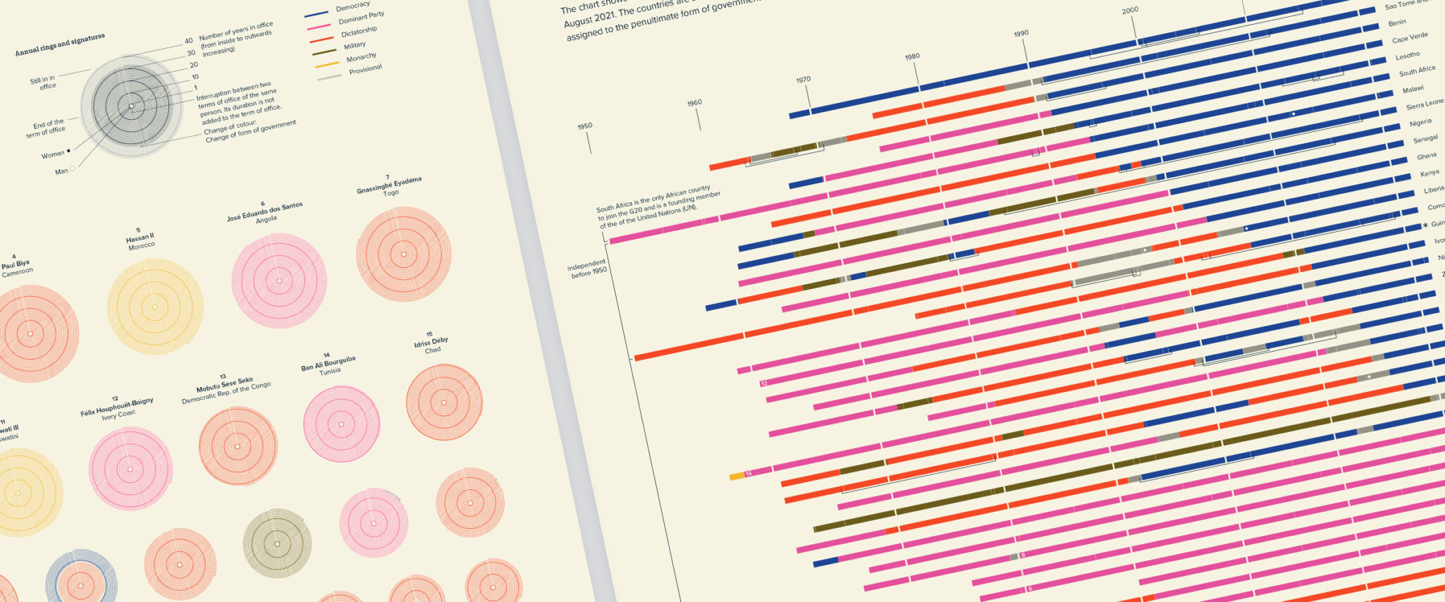
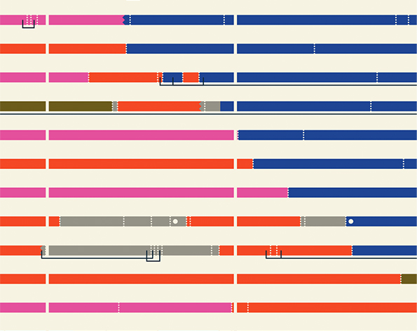
↑Detail pictures of the two visualizations
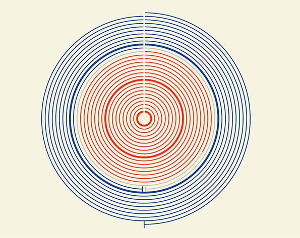
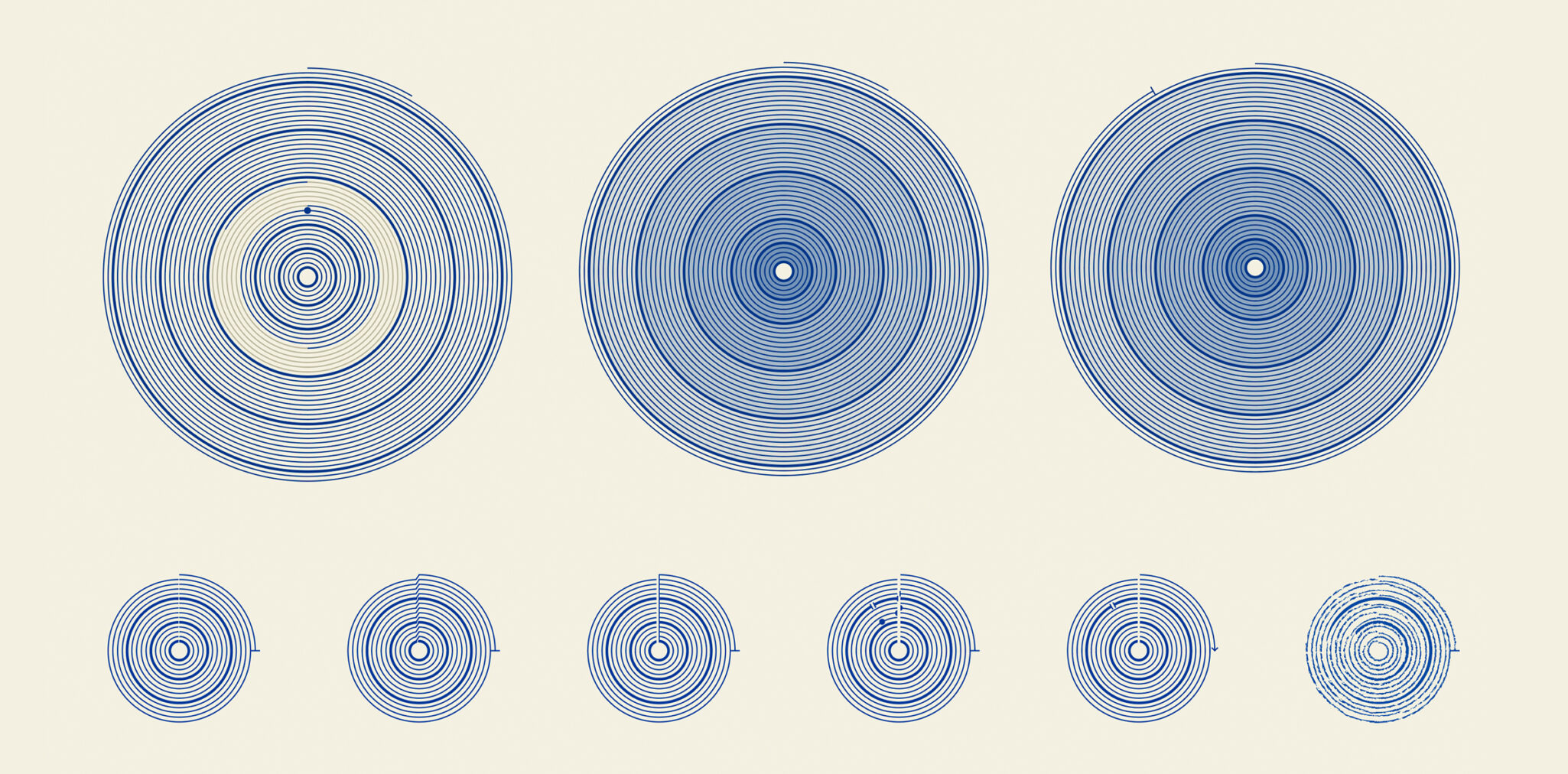
↑ Work in progress view: Visual tests for the annual rings.
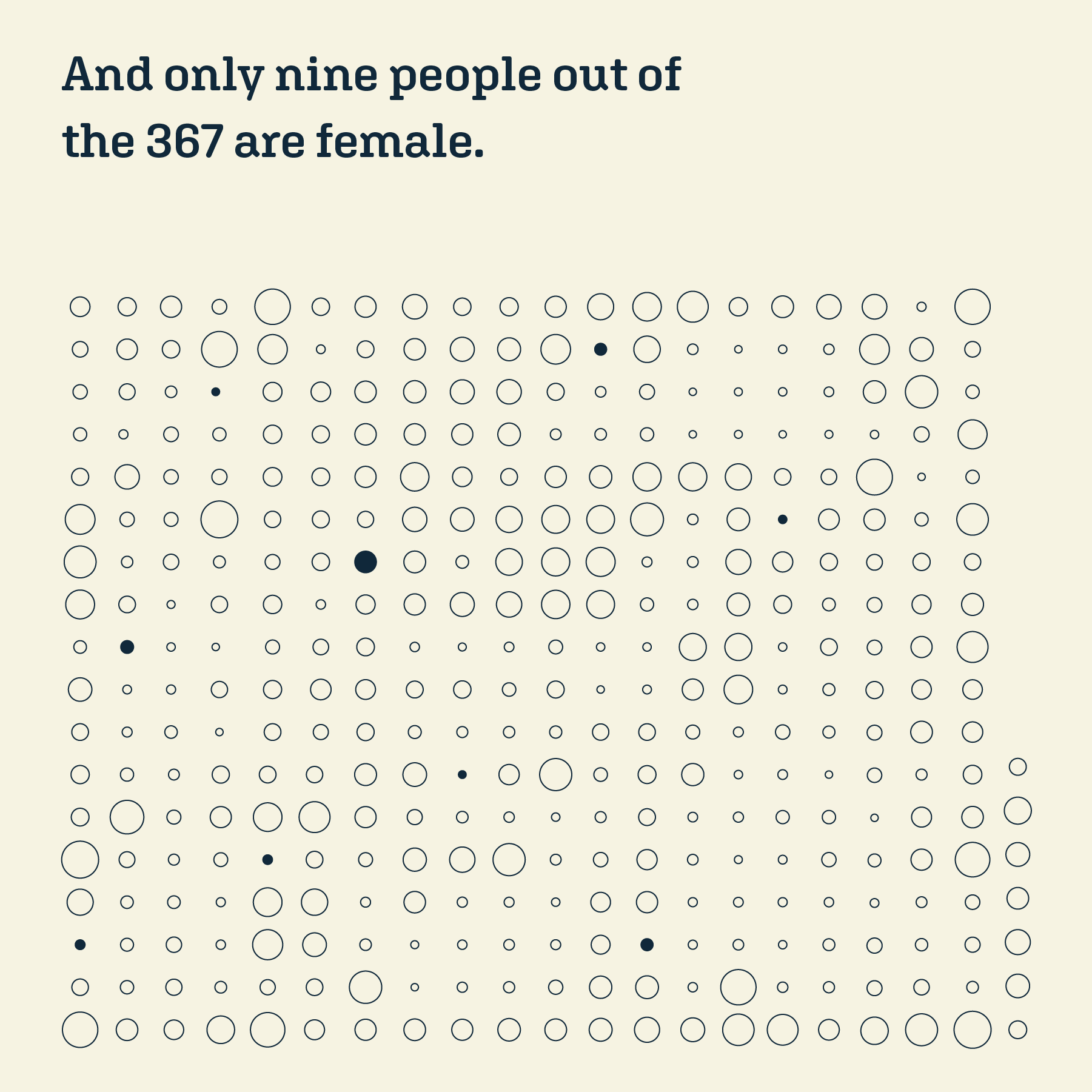
↑ Instagram story showing how far apart the number of female and male presidents are.
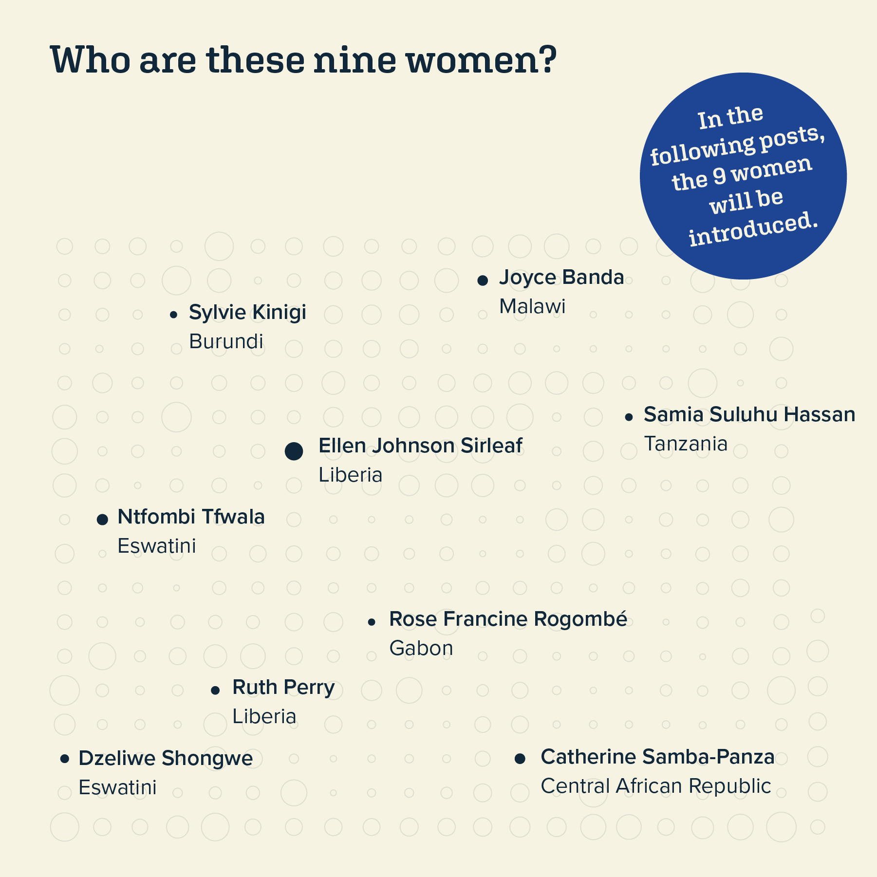
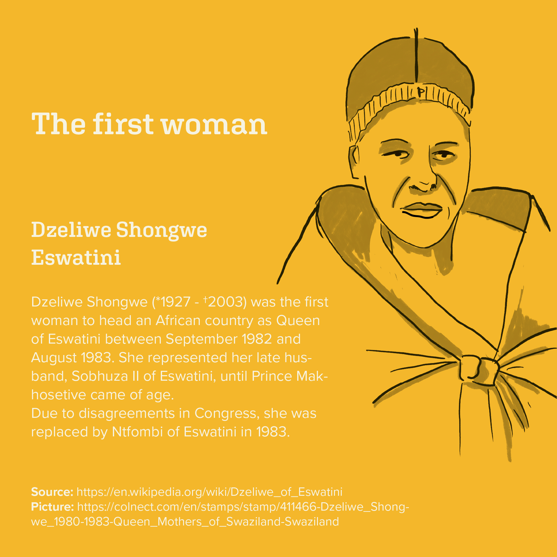
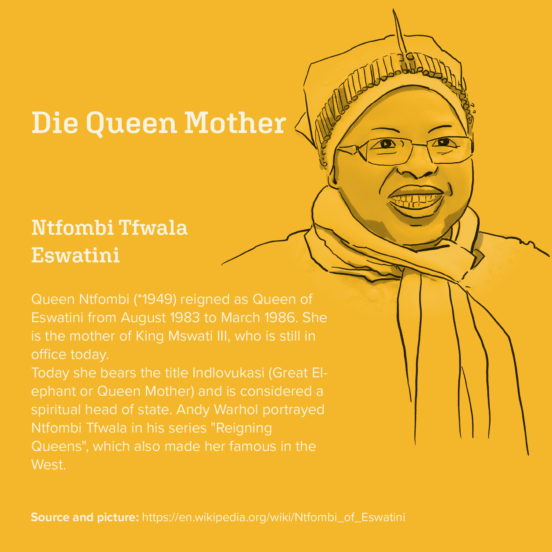
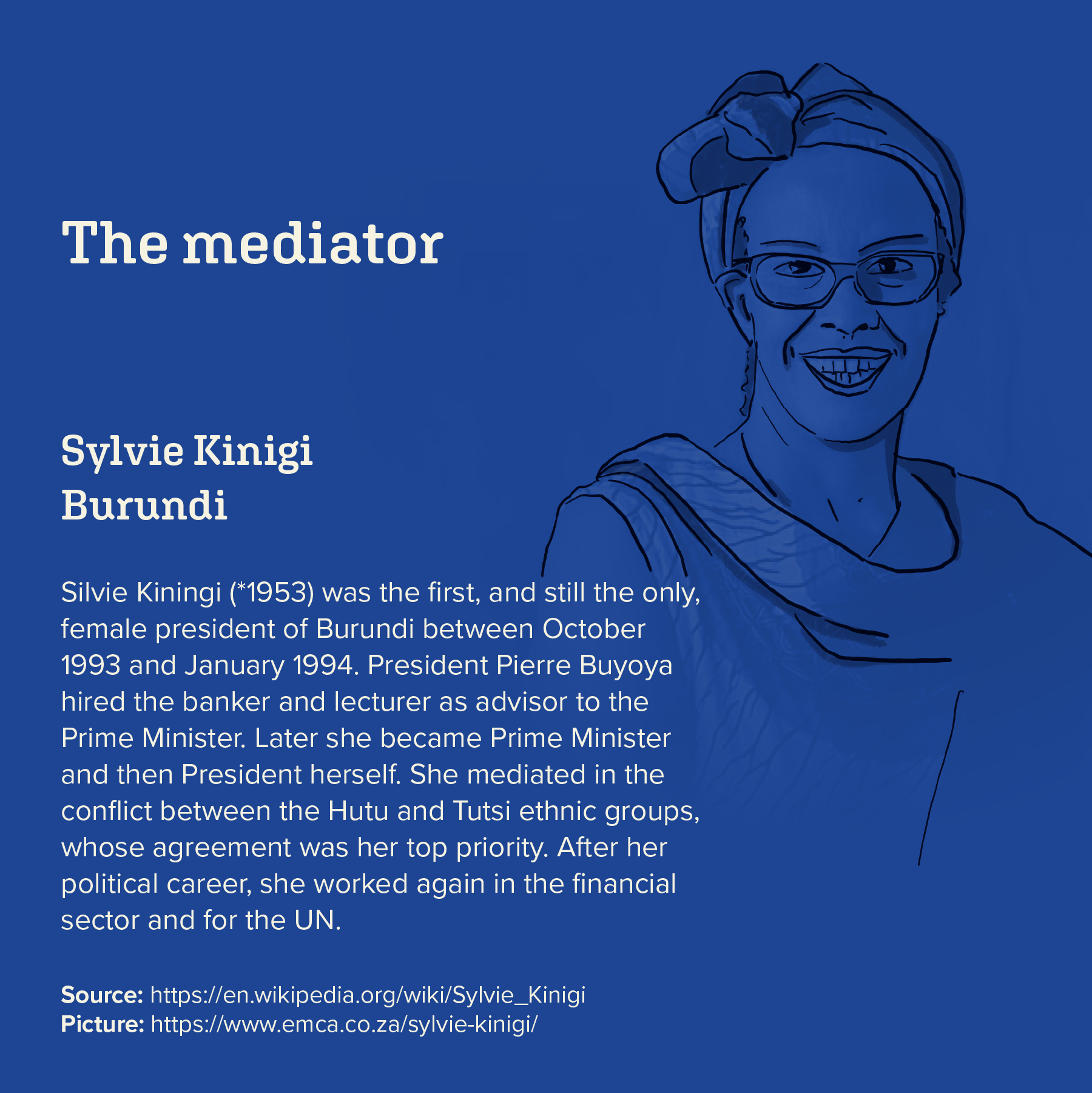
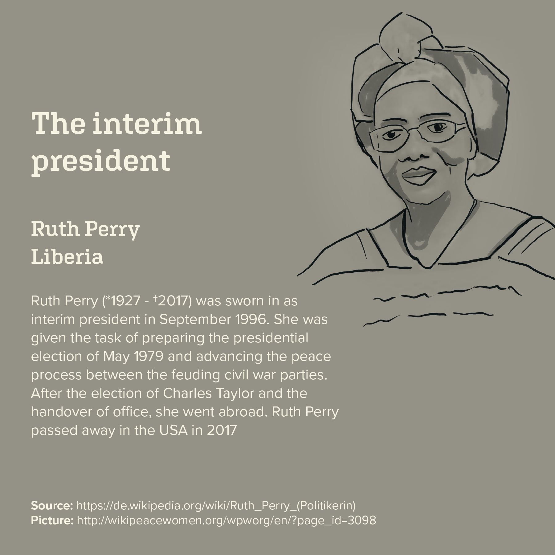
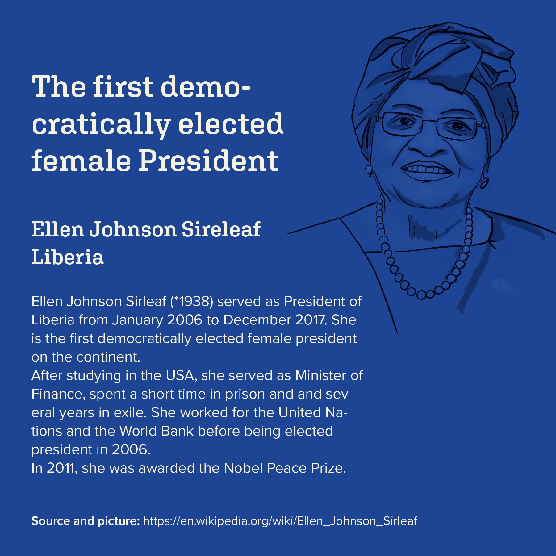
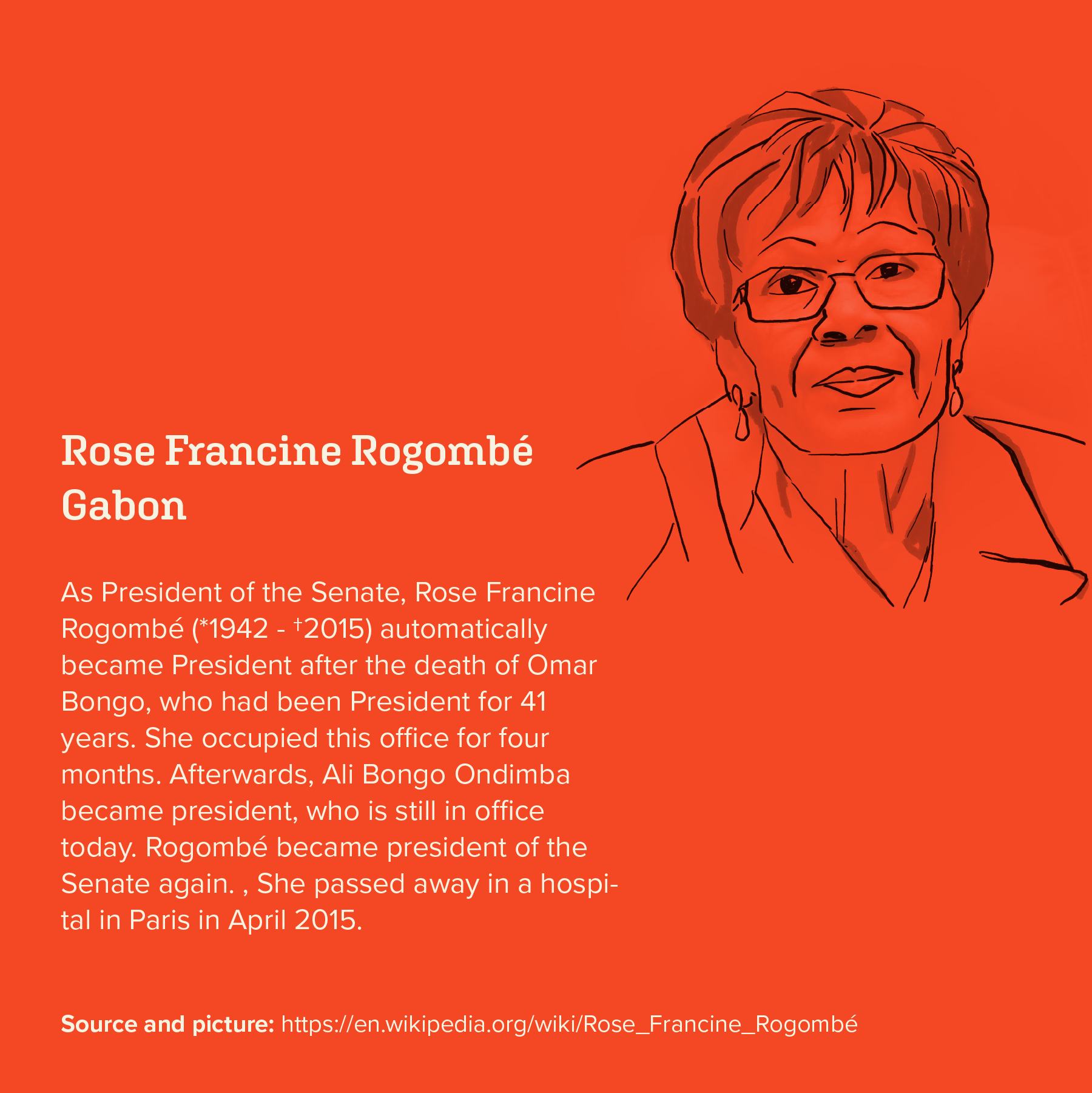
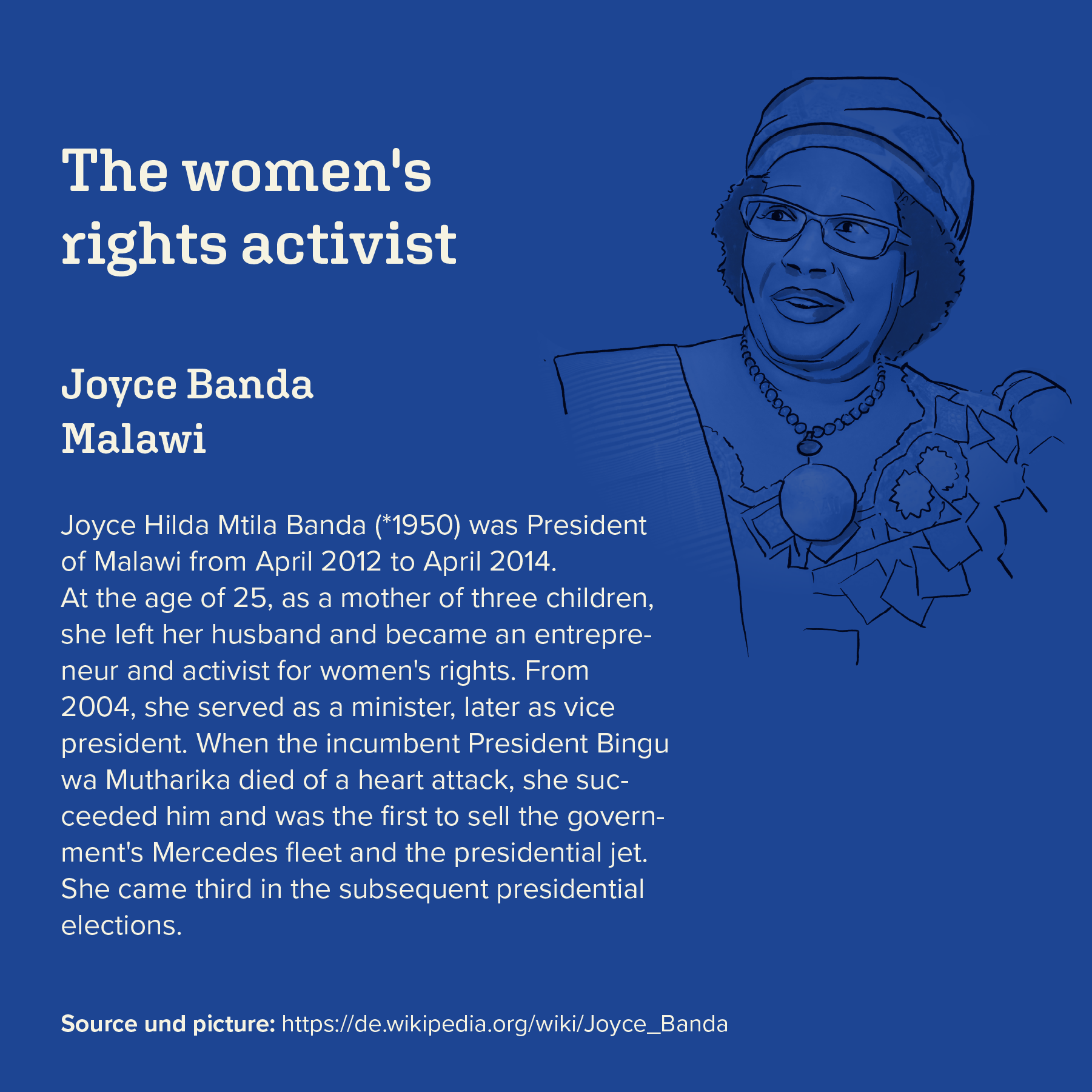
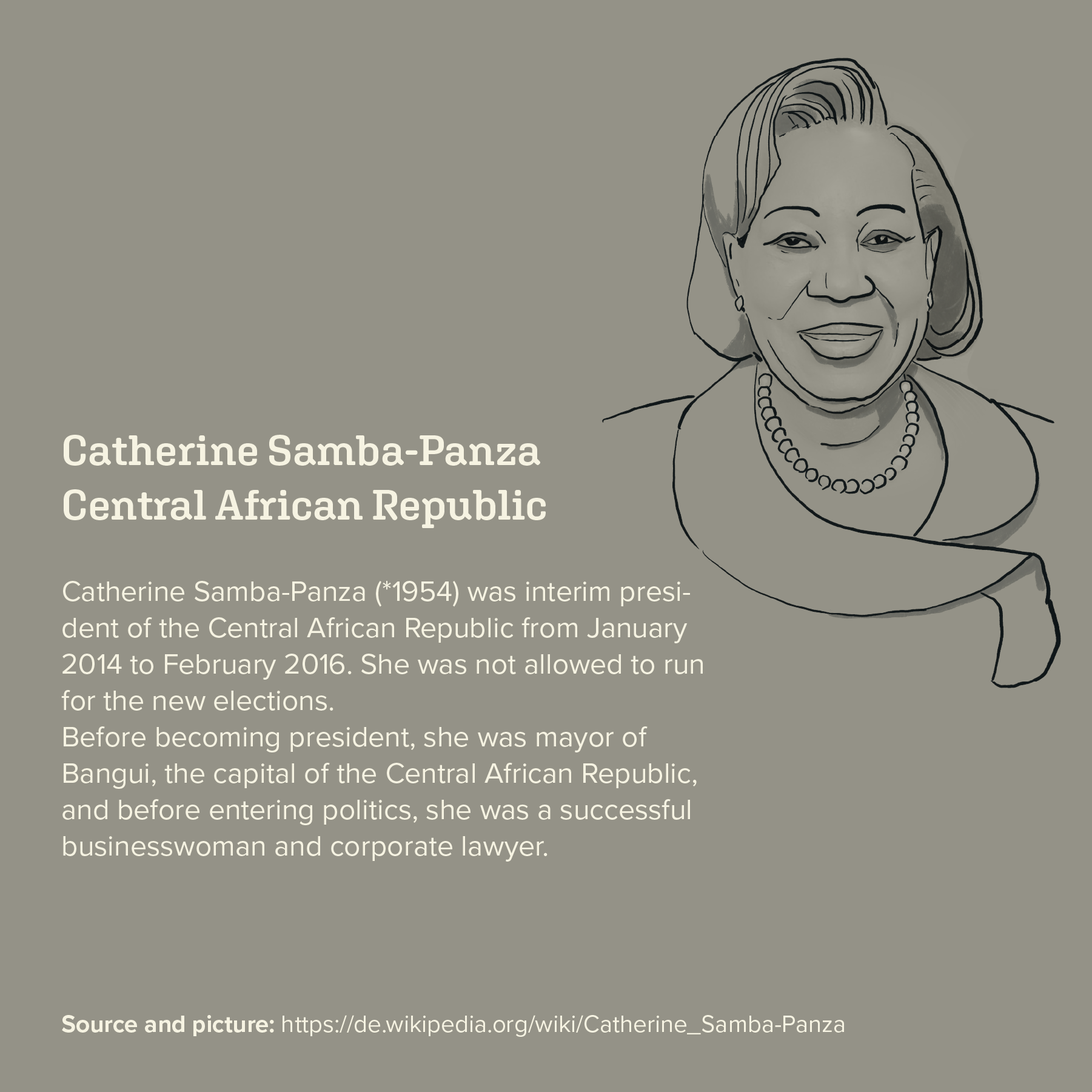
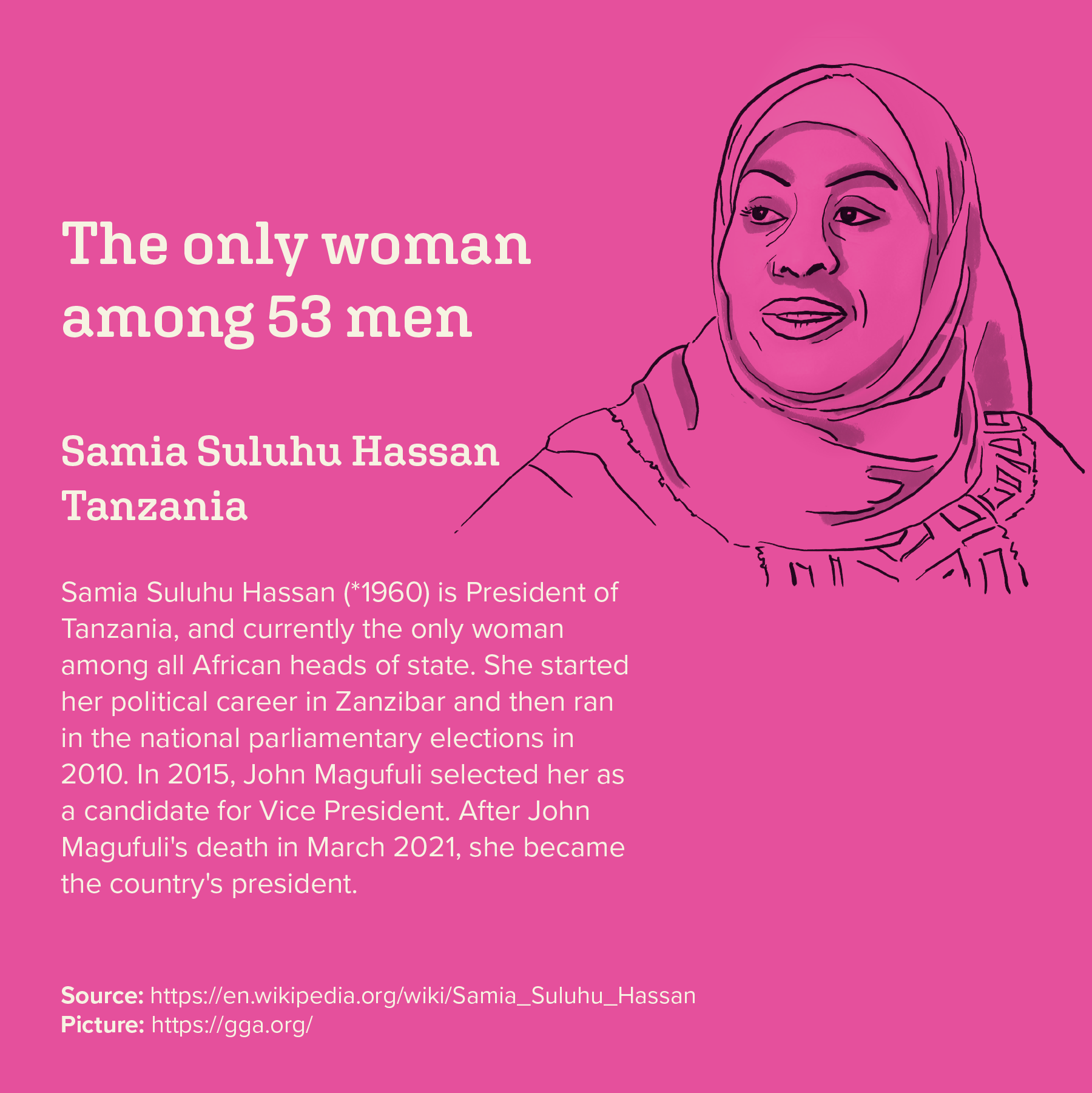
↑ Small portraits about the nine women that were in power till now.